UX RESEARCH · UI DESIGN · BRAND IDENTITY
INTRODUCTION
UOK is a wellbeing product designed to help teachers proactively support their student’s wellbeing. Everyday, students log into UOK and answer a series of questions expressing how they feel. As part of an immersive UX/UI Bootcamp I was tasked with creating an improved user experience of UOK.
MY ROLE
User Research
Product Strategy
UX Design
UI Design
Prototyping
Usability Testing
TOOLS
Figjam
Figma
Maze
TIMELINE
5 weeks
CURRENT EXPERIENCE
PROBLEM STATEMENT
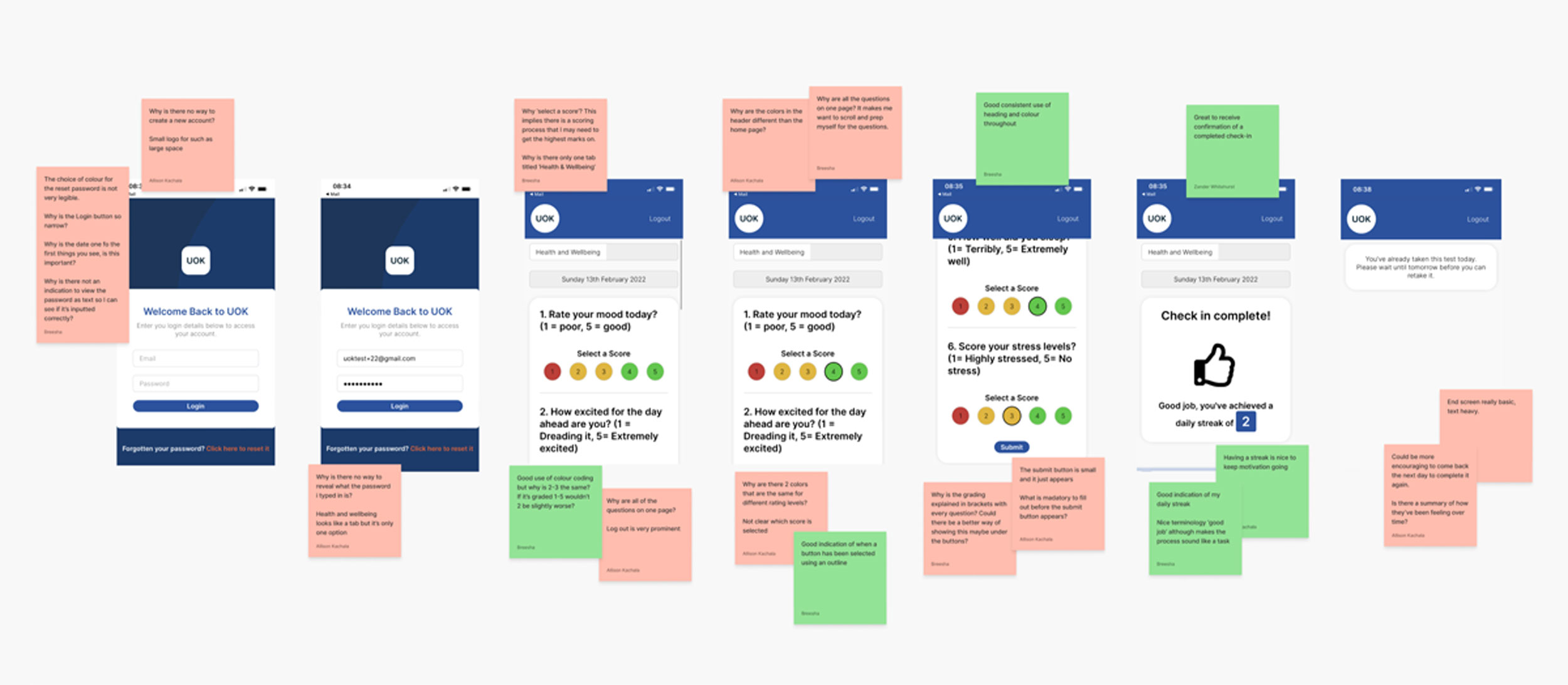
Although the user experience was simple and straight forward to complete to the questions, users found it impersonal, unsupportive and unengaging to use. Alongside this, users also wanted the option to be able to expand more on their feelings, as currently the product lacks opportunity to gain more insight into the students wellbeing. How might we create a more personal and engaging experience for the user and provide them with relevant information to get support dependant to their check-in results.
BREAKDOWN OF THE PROBLEM
When using the product, users are presented with an impersonal, monotonous interface, which results in them not wanting to use the app.
When completing the UOK check-in, users are unable to put any further description about their mood and are faced with no actionable response, which results in the product ultimately failing in achieving its purpose of supporting students.
Users cannot view any previous check-ins, making the product impersonal and with no motivation for the user to continue using.
THE SOLUTION
The product already had a basic questionnaire structure but lacked in appearance and personalisation. My solution is to expand the check-in experience and enable the user to better explain why their feeling this way to help teachers gain a better insight into the students wellbeing, as well as providing extra features to support then in their wellbeing.
IDEATING AND CONCEPTUALISATION
IDEATION
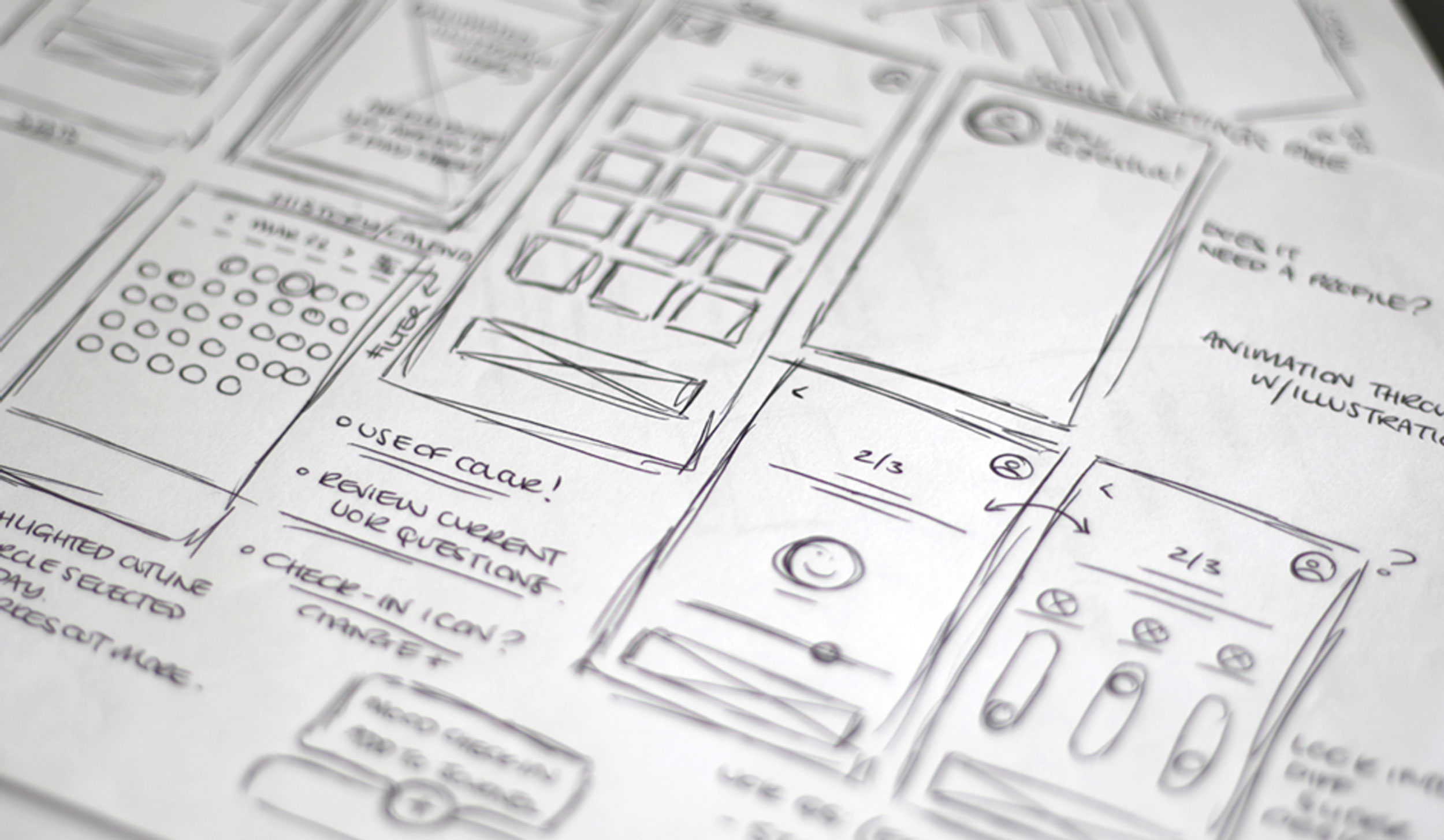
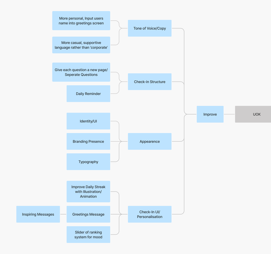
To begin the conceptualisation of the improved check-in experience I conducted a series of ideation techniques. This allowed me to consider an array of solutions.
A lot could be improved with the current experience which would greatly impact the product, such as updated the appearence to making the check-in experience more personalised and fun.
IDEATION
The product lacked any personalisation or incentive to bring back users, encouraging then to use the app daily.
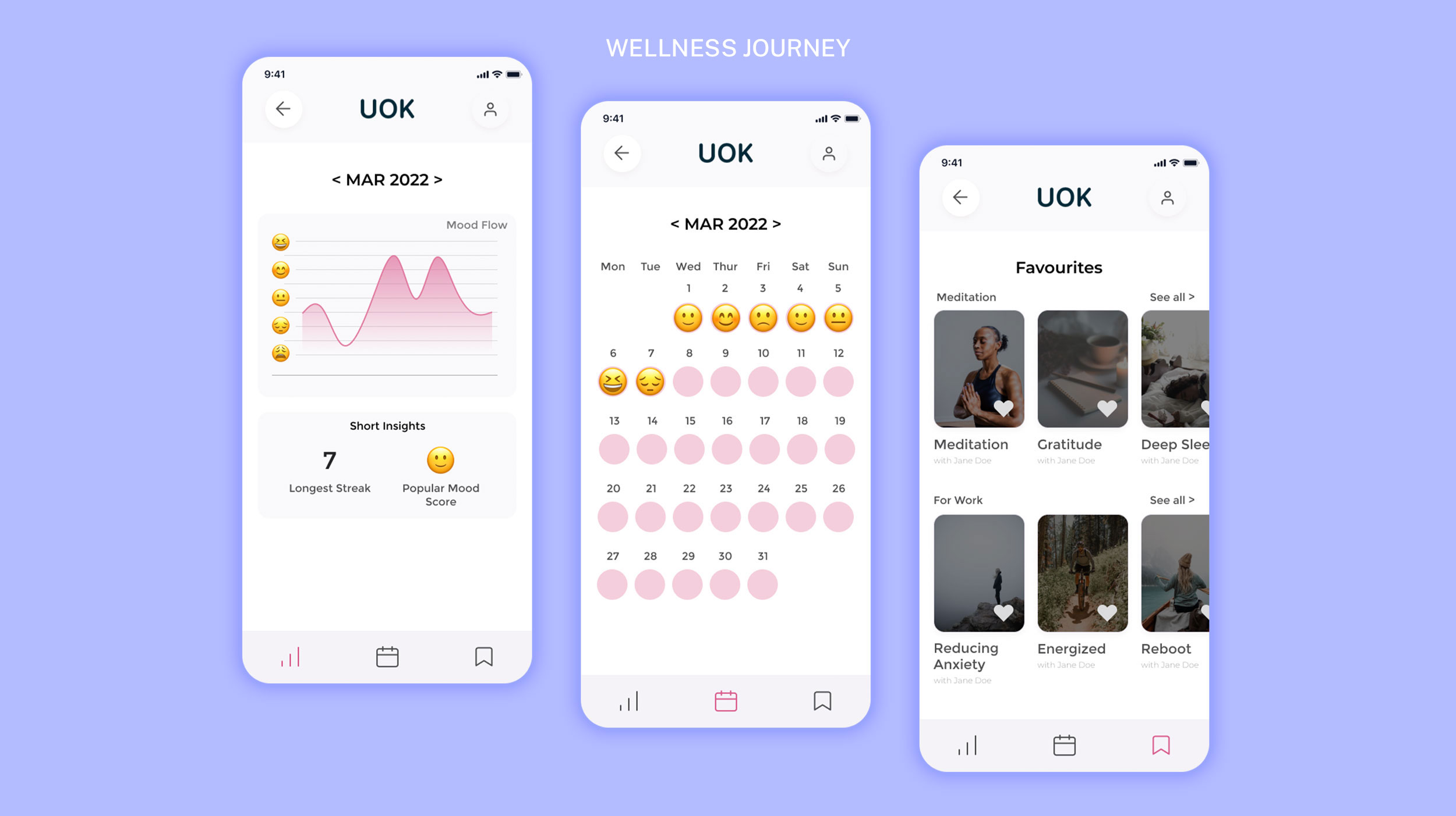
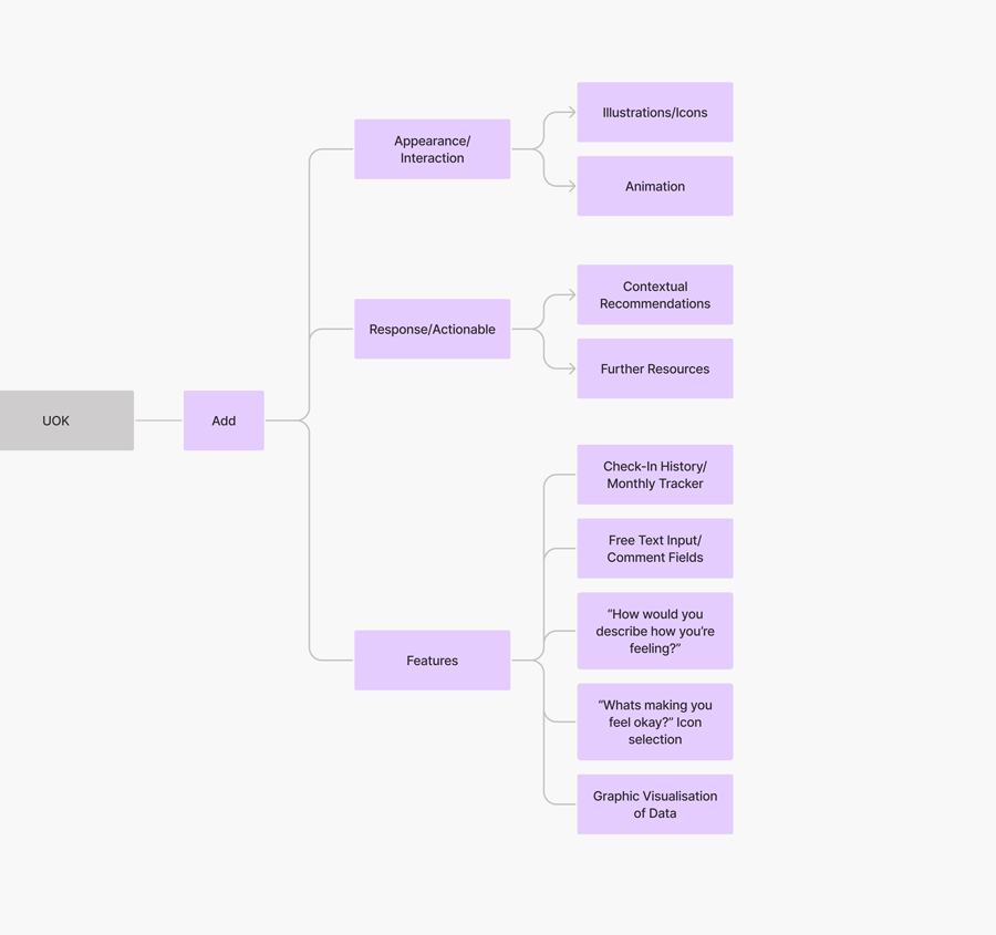
I took the decision to add more responsiveness and interaction to the experience and add more features including monthly tracker, check-in history, visualisation of data and a daily streak feature, all of which motiving the user to use the product.
IMPROVEMENTS
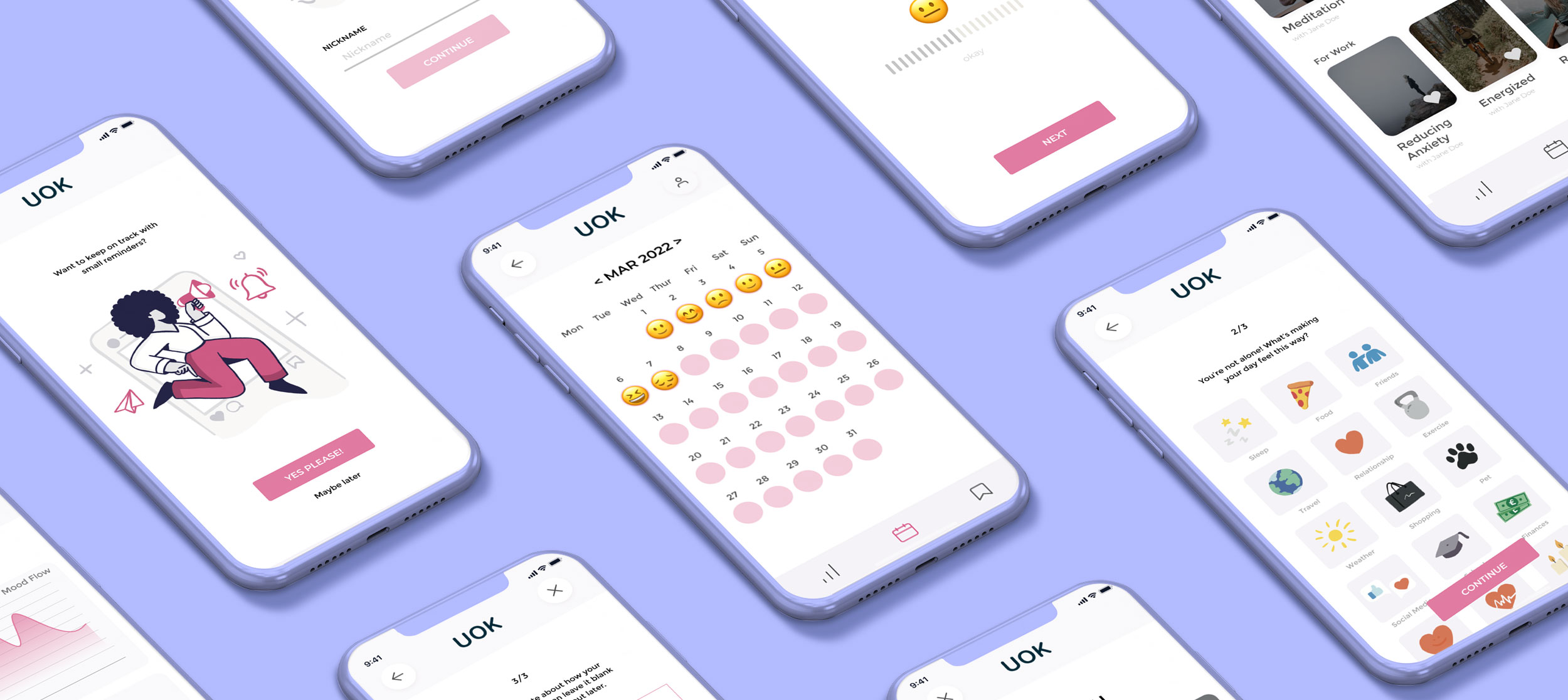
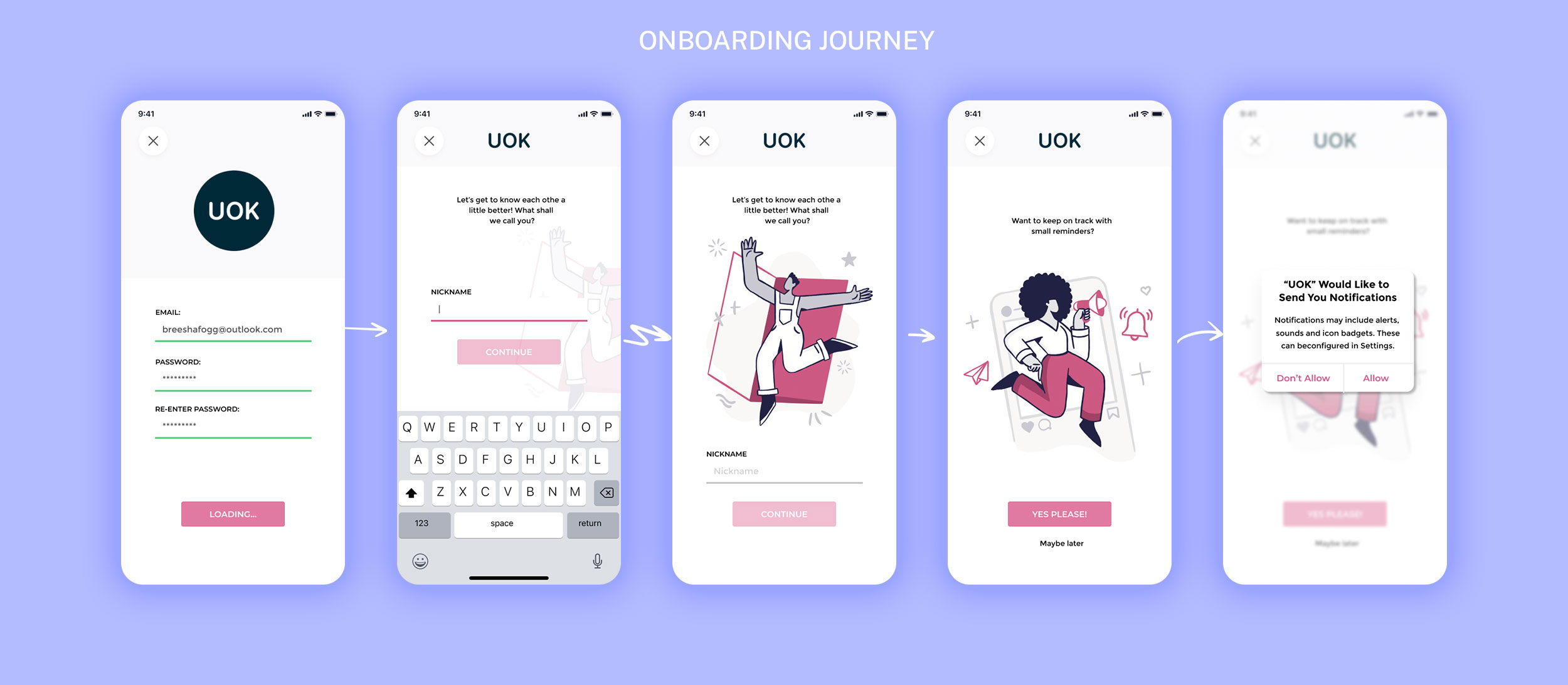
As part of the onboarding experience we made users input a nickname. This is then incorporated into a welcome message on the dashboard, enhancing the personalisation of the experience.
As an incentive to help users complete their daily check-in we created an optional reminder notification during onboarding.
HI-FI PROTOTYPE
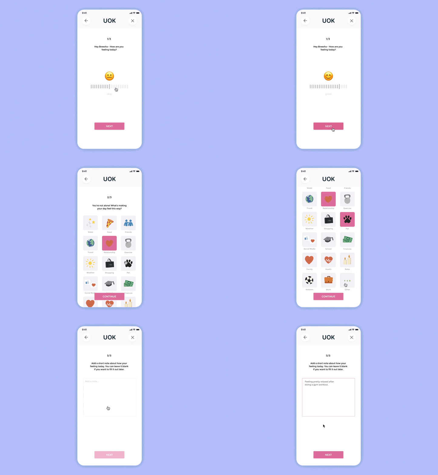
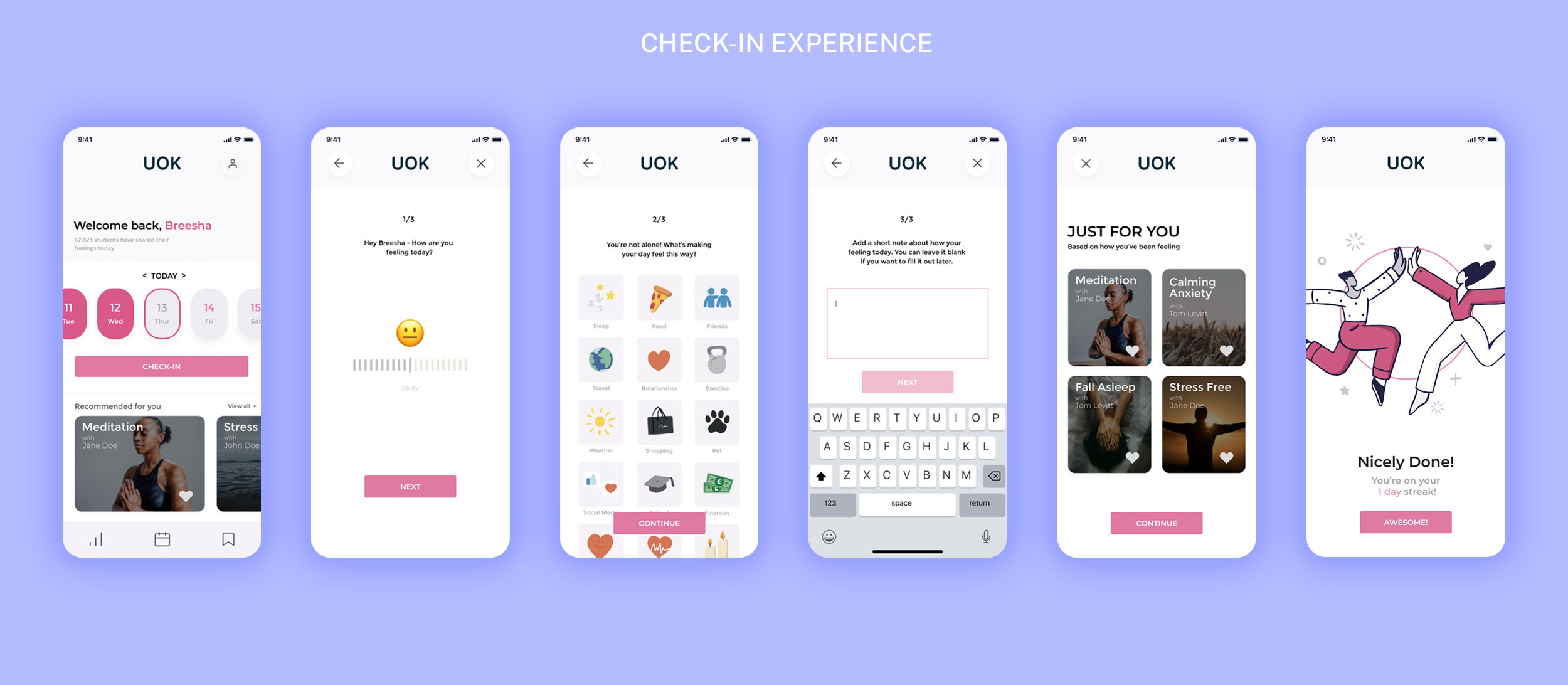
The current daily wellness check-in experience of UOK is basic with students answering a series of questions using a color-coded rating scale from 1-5. After careful thought and consideration, I re-defined the questions being asked to gain more insight into the students wellbeing as well as making it a more fun enjoyable experience.
HI-FI PROTOTYPE
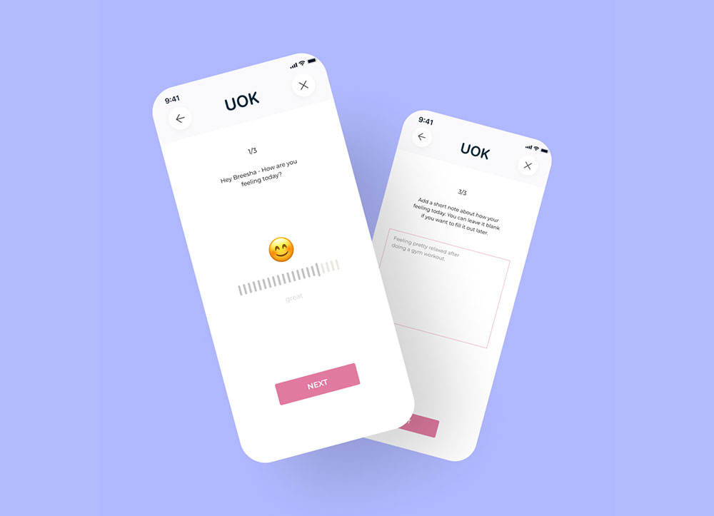
The experience now has an interactive slider that is responsive with a fun emoji represented on how they are feeling. Students can also choose to elaborate how they are feeling by leaving a short note as part of their daily wellness check-in. The overall experience is much more fun, engaging and insightful to the students wellbeing.
HI-FI PROTOTYPE
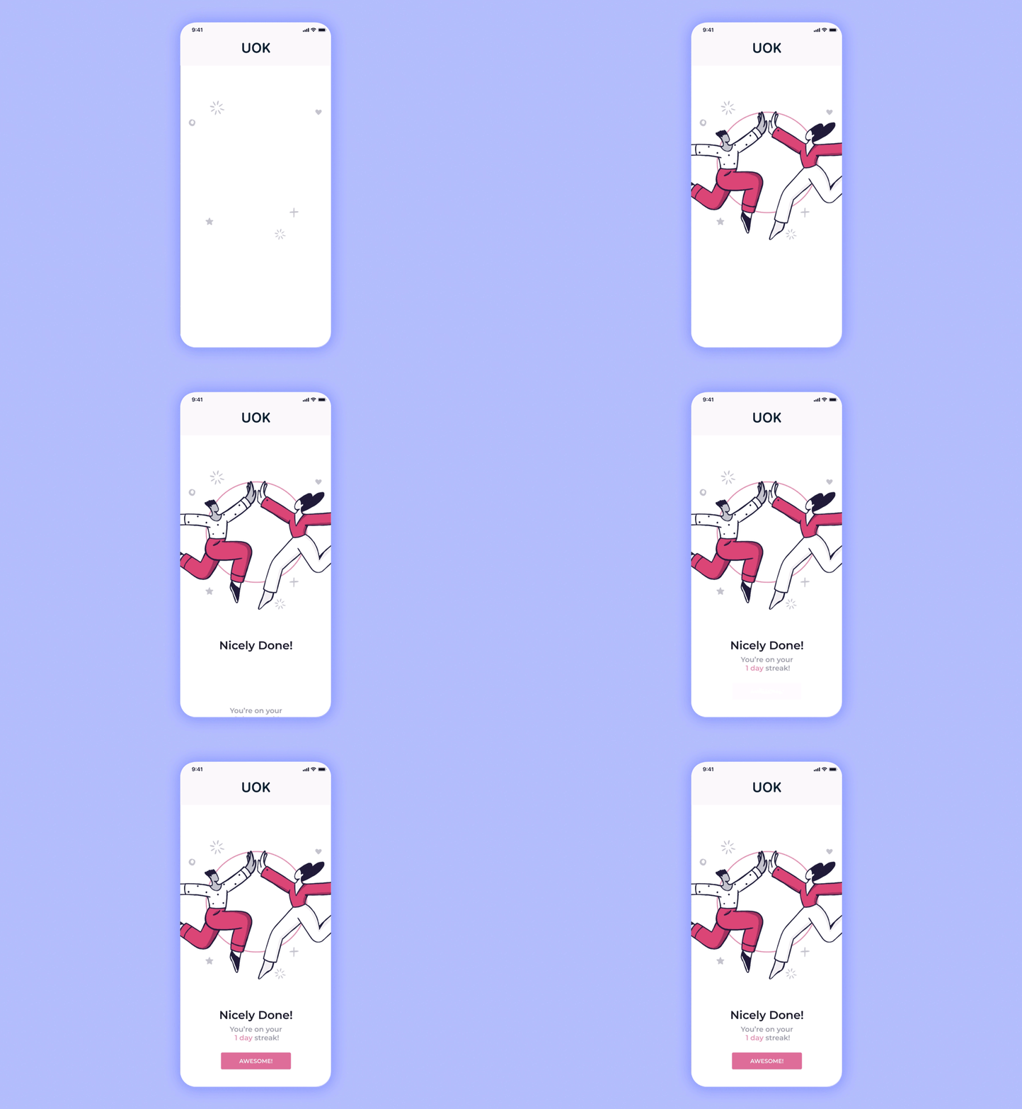
We’ve implemented daily streaks into the check-in experience, incorporated with fun animation to make the experience fun and encourage students to retain their check-in streak.
