UX RESEARCH · UI DESIGN
INTRODUCTION
So Energy is an energy company dedicated to delivering affordable and sustainable energy solutions. As part of improving acquisition rates I was tasked with optimising the Get a Quote journey for energy supply.
PROBLEM STATEMENT
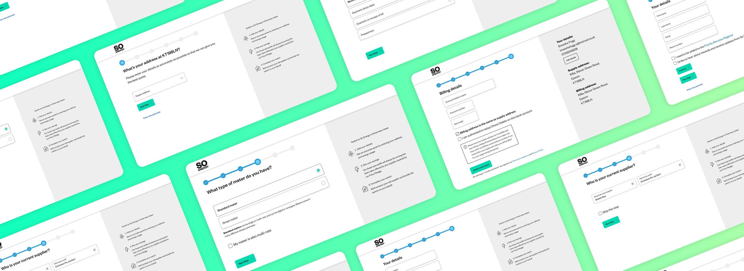
When users go to get a quote for energy supply from So Energy they currently go through a 14 steps process to get their personalised quote. Although the user experience was simple and easy to complete, users found it impersonal, unsupportive and engaging. In particular most users dropped off after step 5. How might we add more functionality to create a more personal and engaging experience to improve the Get a Quote journey in driving acquisition rates and increased usability.
BREAKDOWN OF THE PROBLEM
When trying to obtain a quote, users have to complete a long 14 step form to get their quote, resulting in a high drop-off rate.
In the current tariff preview the design lacks any personality and doesn’t include any upselling features on why a customer should select this particular tariff.
The interface was dull and boring, resulting in customer drop off.
Although it was a good feature to include a progress indicator in the journey, it was misleading to customers as in some steps, step 3 would have multiple questions implemented until you could progress to step 4.
THE SOLUTION
HI-FI PROTOTYPE
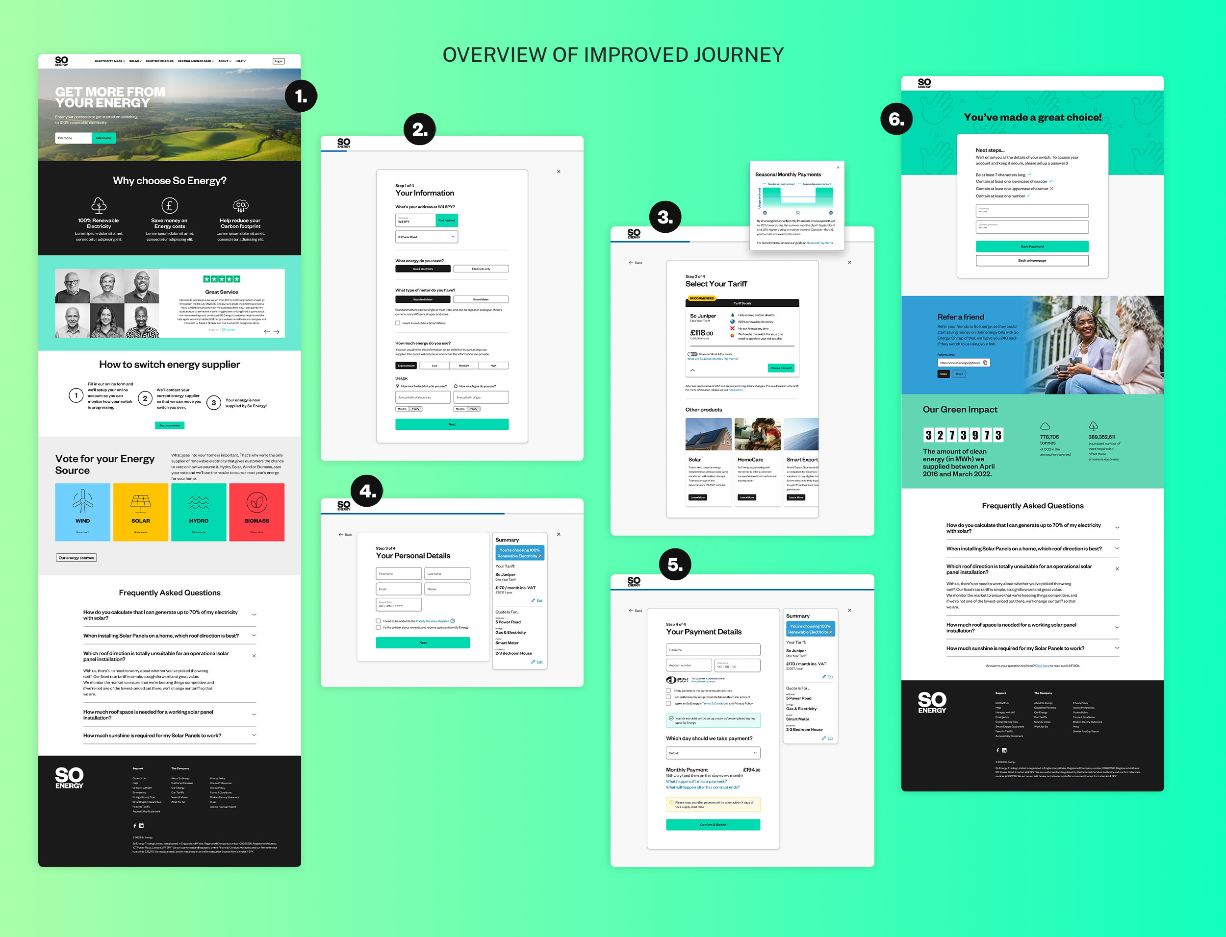
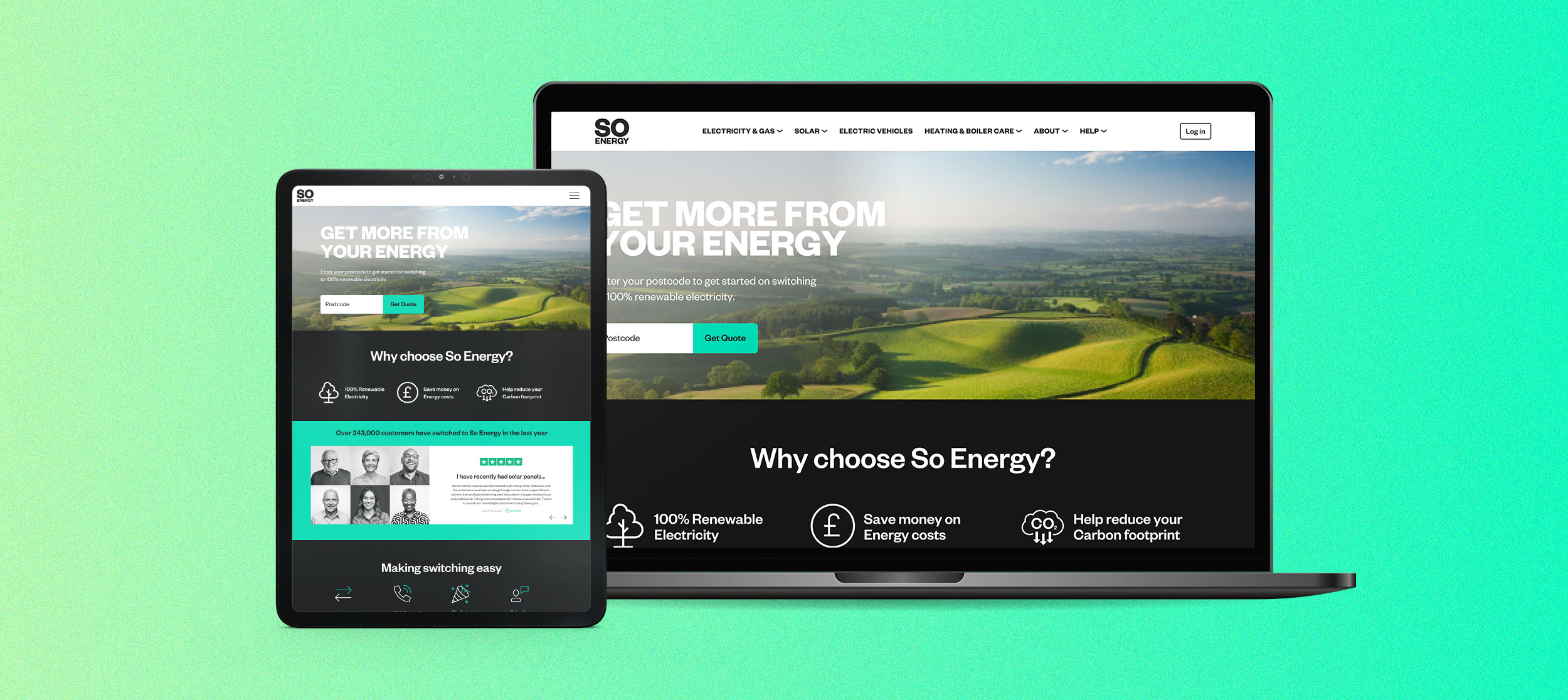
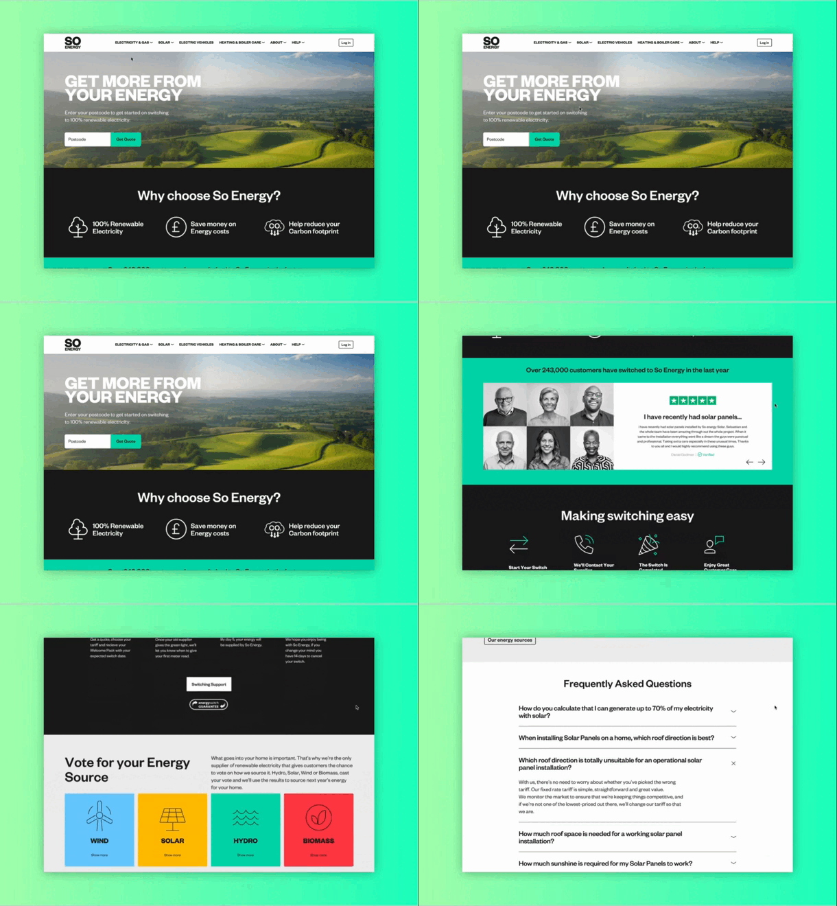
The old landing page comprised of a simple CTA and footer. The new and improved landing page now upsells So Energy; utilising imagery, showing clear marketing strategies and including testimonials to gain customer trust of confidence in the company.
HI-FI PROTOTYPE
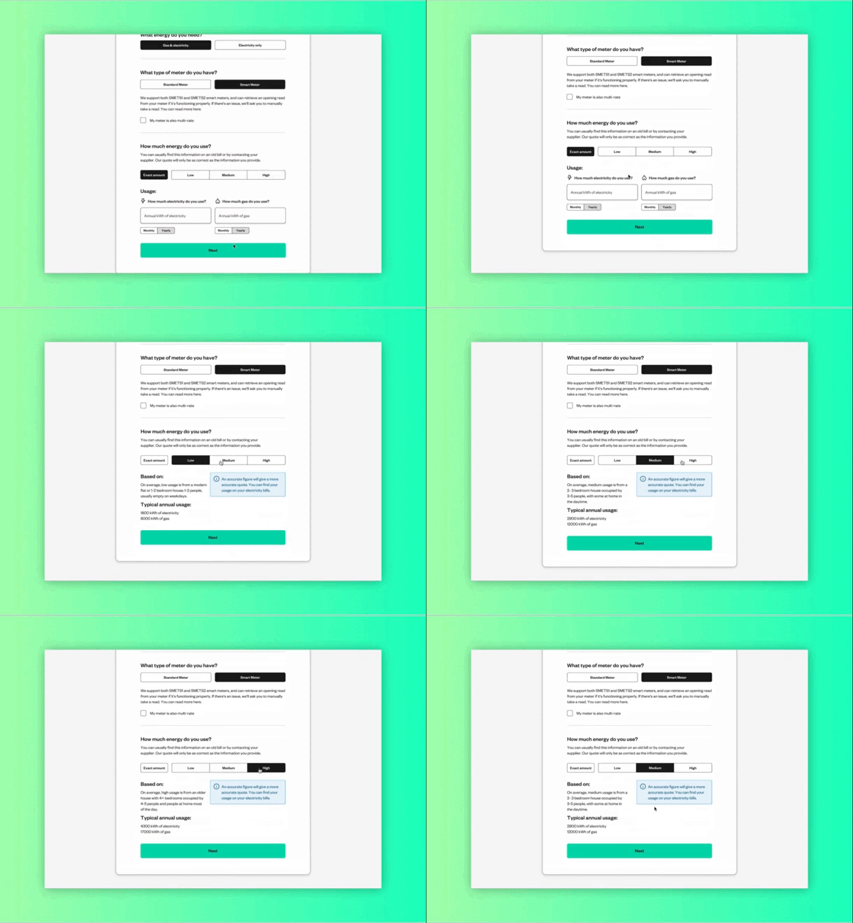
A compelling feature that was not included in the previous journey was giving the customer the ability to choose industry standard EAC (Estimated Annual Consumption) figures. This is helpful when customers can’t give accurate readings whilst filling in the form.
HI-FI PROTOTYPE
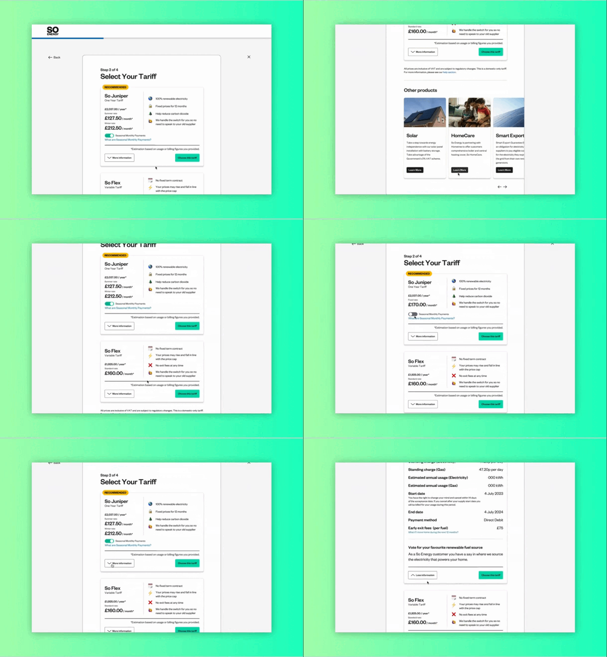
We’ve improved the look and feel of the tariff cards by showing clear annual/monthly pricing and showing clear USPs to differentiate the differences between tariff. We have also given more control to the customer in how they want to pay for their energy, whether it be seasonal to fixed rates.
HI-FI PROTOTYPE
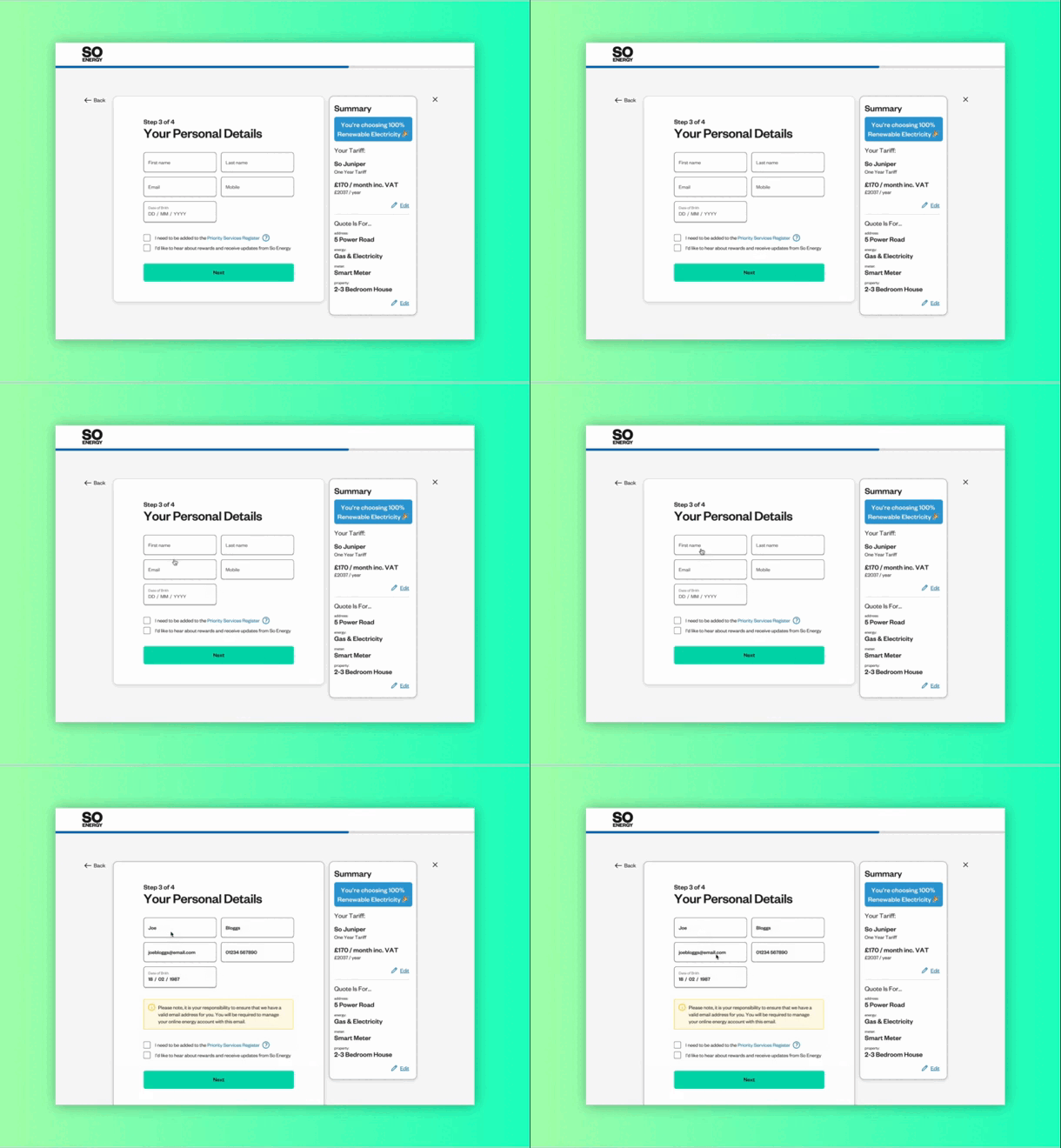
To give the customer more confidence and clarify in confirming their new tariff we have adding in a summary sidebar.
