UX RESEARCH · UI DESIGN
INTRODUCTION
Unplugged is a digital booking platform that offers beautiful cabins in nature for you to unwind, switch off and enjoy a 3-night digital detox. They offer an experience to busy city folk to unplug from their devices and recharge without flying halfway around the globe. As part of an immersive UX/UI Bootcamp I was tasked with optimising the search experience for Unplugged.
MY ROLE
User Research
Product Strategy
UX Design
UI Design
Prototyping
Usability Testing
TOOLS
FigJam
Figma
Maze
TIMELINE
5 weeks
OVERVIEW OF THE OLD EXPERIENCE
PROBLEM STATEMENT
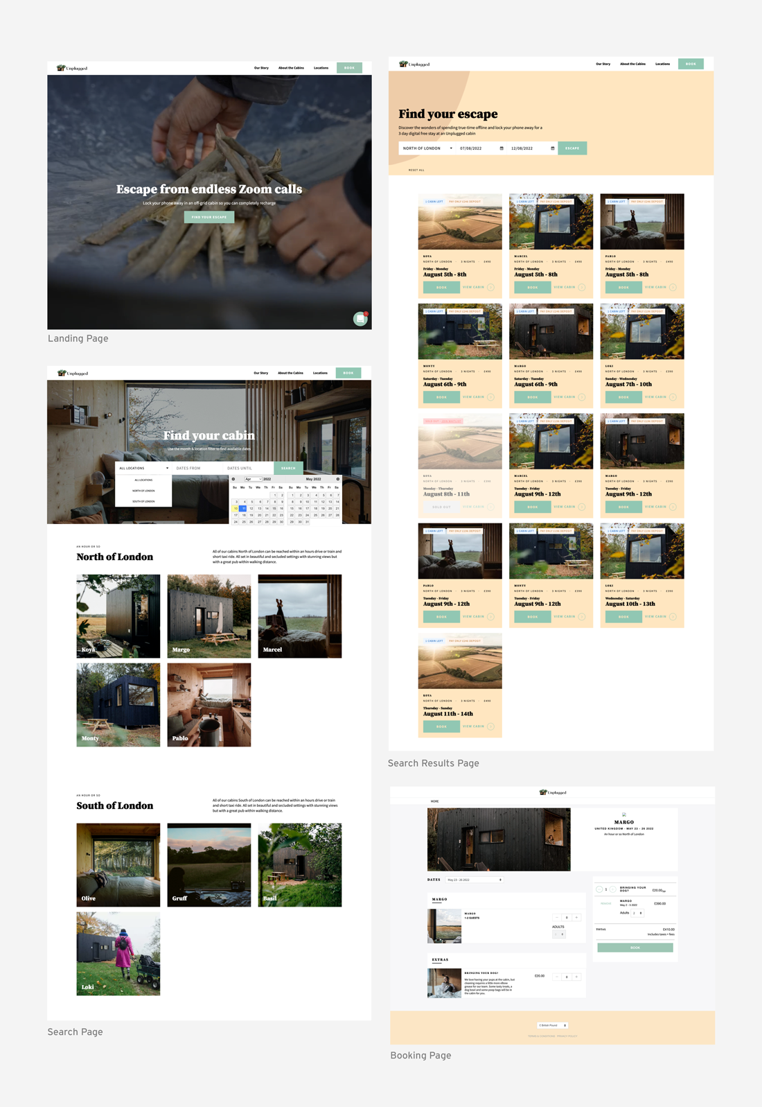
When searching for cabins, users currently filter through a series of drop downs to find a cabin. It’s not obvious for users which months are available and ideally they’d like more flexibility when searching and booking a cabin.
BREAKDOWN OF THE PROBLEM
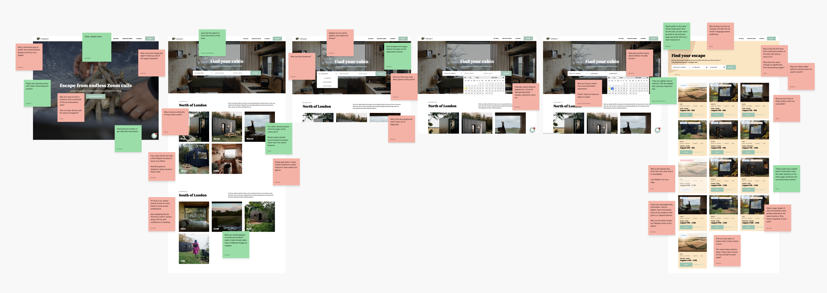
The search functionality doesn’t allow the user to efficiently filter the search to their specific needs and the search results are confusing and disjointed.
The experience is specific to a 3-night booking which is not evident throughout the search and booking experience. It’s not obvious which months are available and lacks flexibilty in booking.
When searching for the cabin location, users are presented with just two very broad options in a drop down.
Cabin information, what’s included and guest booking information is disjointed throughout the experience.
THE SOLUTION
PROCESS
PROCESS
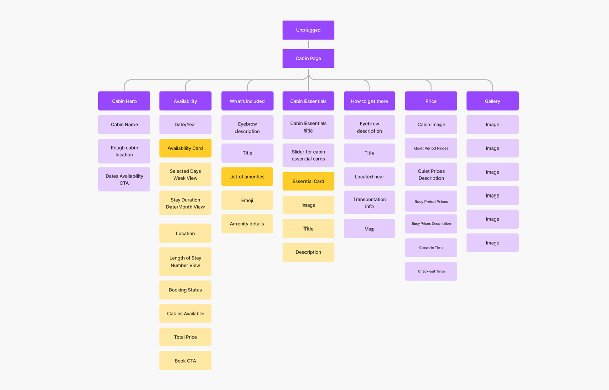
Following the usability review, I mapped the information architecture of the product. After reviewing the current IA, I rearranged this for optimal findability and understandability.
IDEATION
WHAT CAN I IMPROVE?
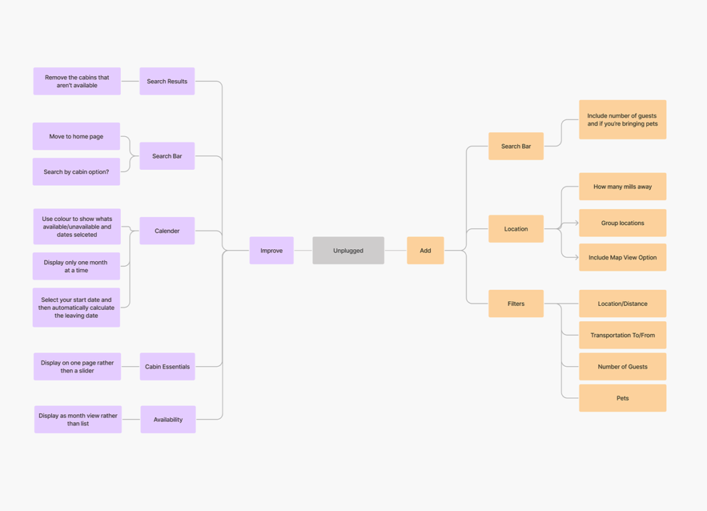
The main design goal was to improve the search functionality, adding better filter options and previewing the search results in a cohesive manner.
WHAT CAN I ADD?
Location was a massive selling point for these cabins experiences so we adding a more visual way to display this throughout the experience.
STYLES AND COMPONENTS
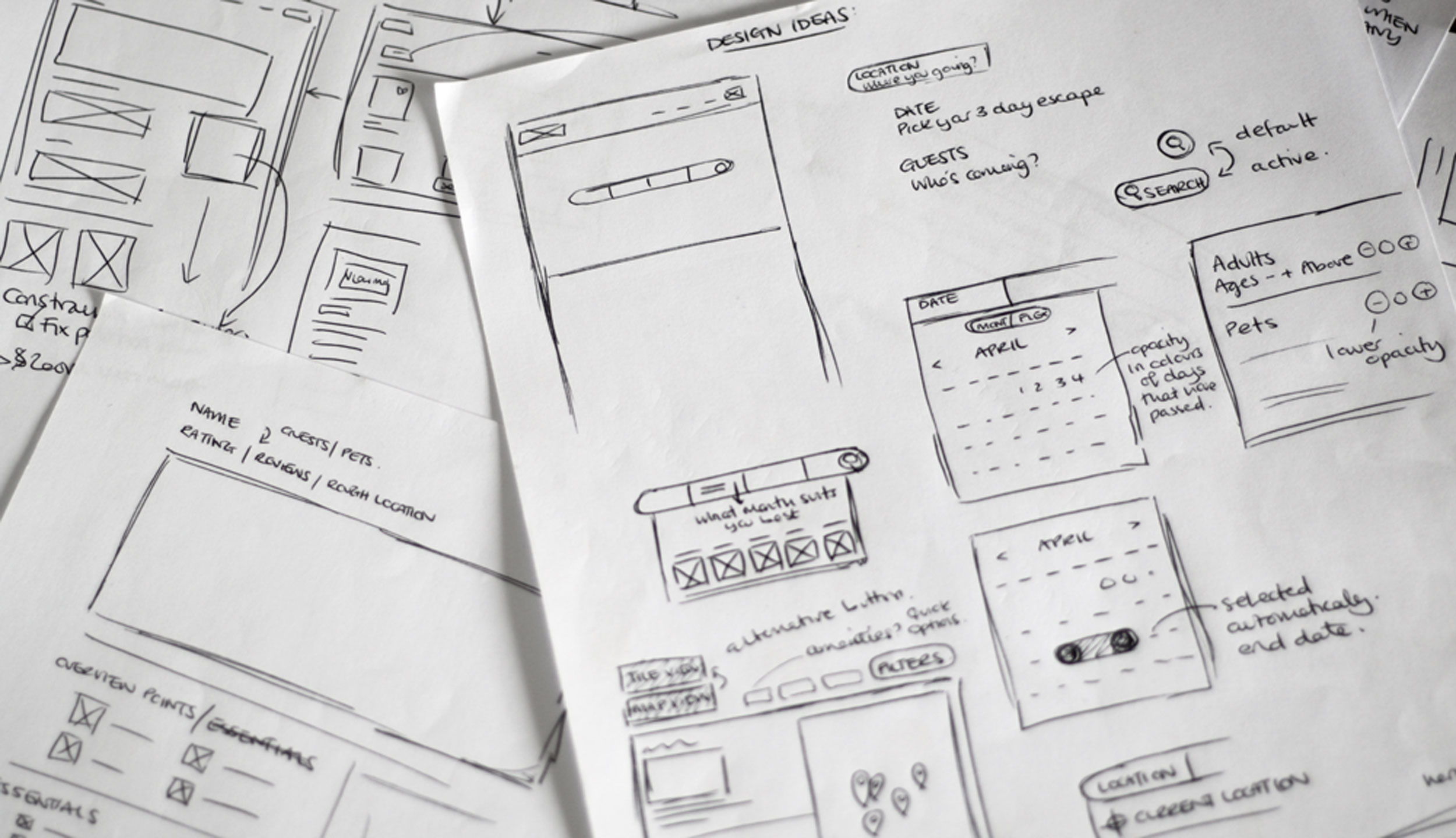
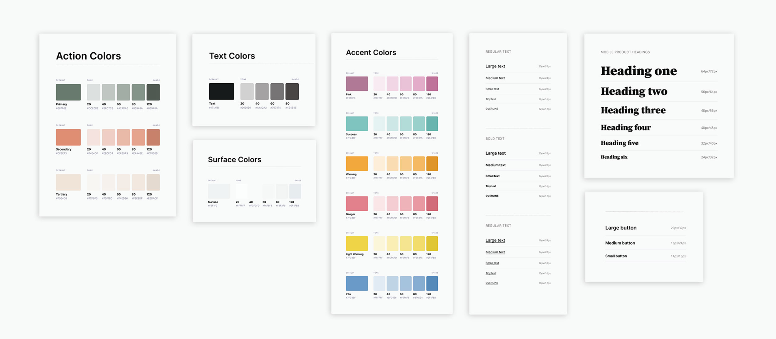
Following my initial sketches, I progressed onto developing a high fidelity version of my concept. To create this I inspected and redefined the current products styles and followed the 8pt rule to effectively and easily create a prototype. To begin this process, I began by defining the basic styles and components within the app.
THE REDESIGNED EXPERIENCE
HI-FI PROTOTYPE
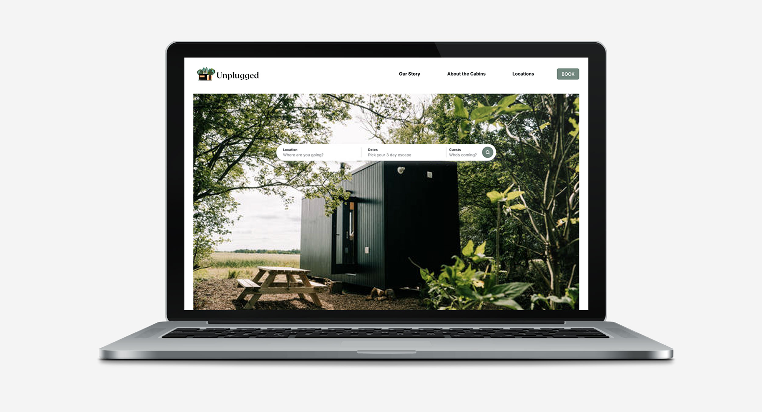
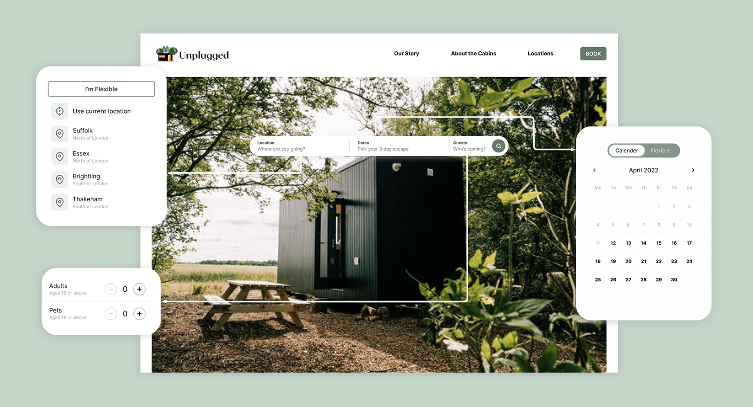
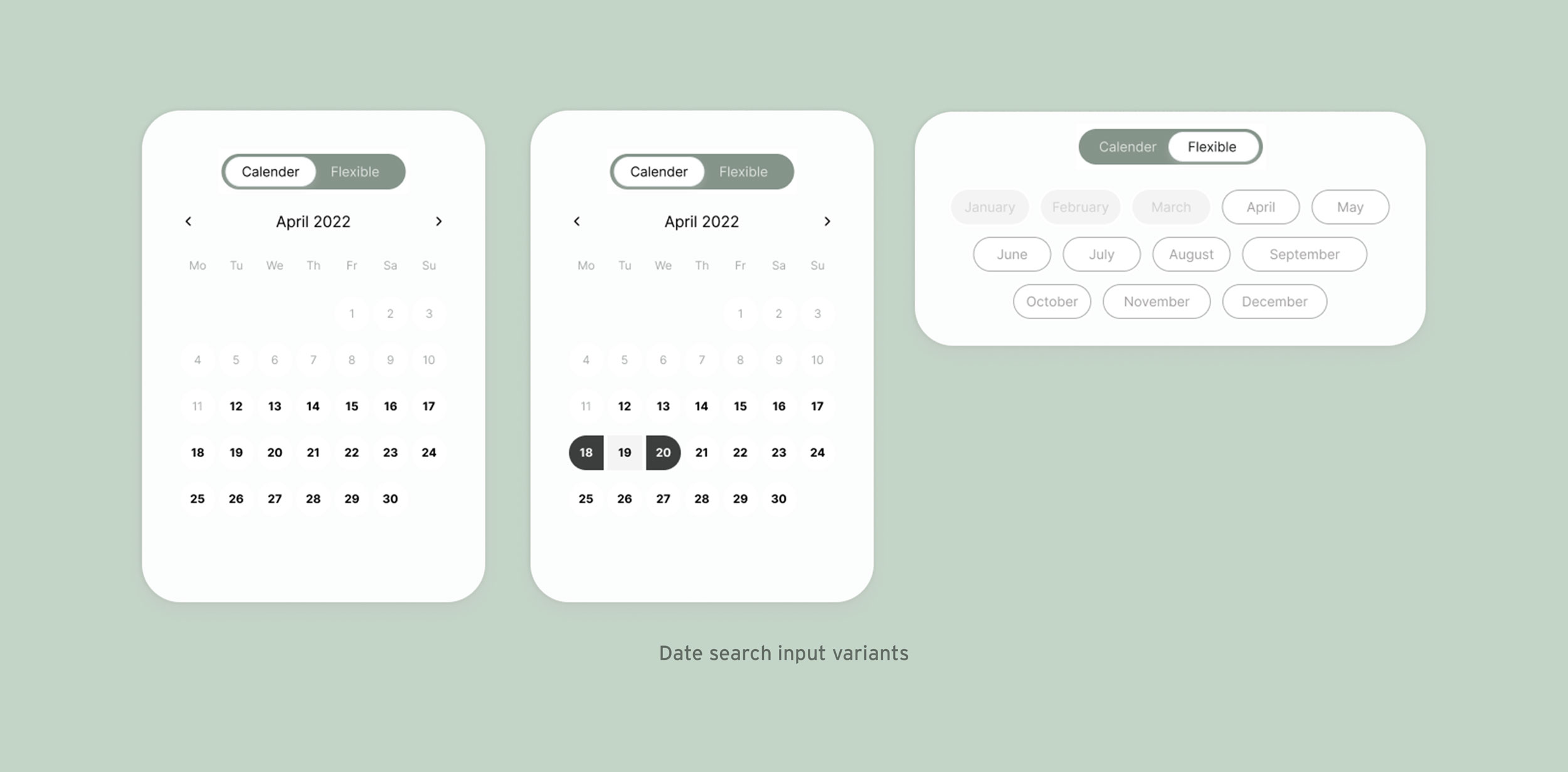
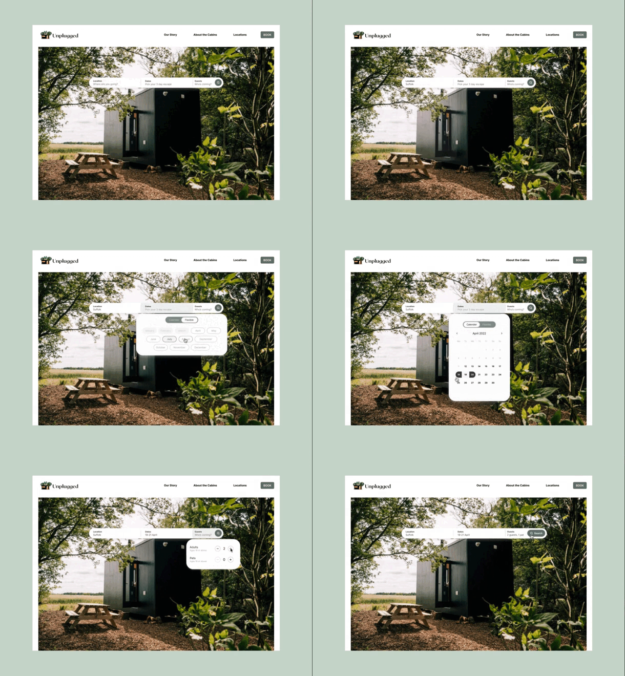
The search functionality in the old experience of Unplugged was inefficient, confusing and disjointed. I have created a new search bar on the main home page, including a more flexible location search field, setting an end date automatically when your start date has been set, reminding users its a 3-night stay and also moving the guests and pets input from the booking page to the search bar.
HI-FI PROTOTYPE
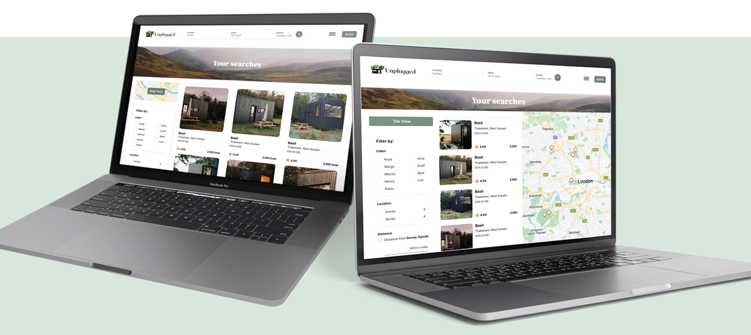
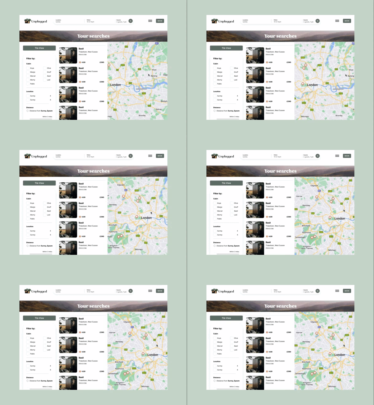
Users can now filter down their search results from cabin names, location and distance from their own address to better help them decide on a cabin that best suits them. As well as this, I have supported with a visual aid of an interactive map to help them see what locations the cabins are in which the preview experience lacked.
HI-FI PROTOTYPE
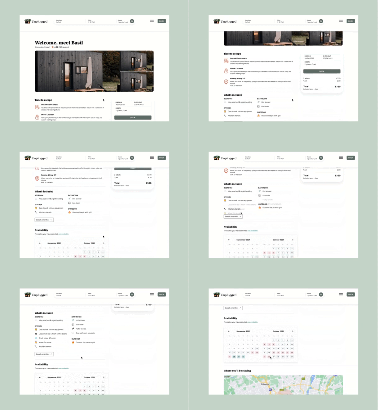
Cabin information, what’s included and guest booking information was disjointed throughout the experience. After reviewing the IA of the other pages I have moved all important information regarding the above to the booking page, giving the user confidence and clarity in what they are booking and the option of altering their dates to better accommodate them.
HI-FI PROTOTYPE
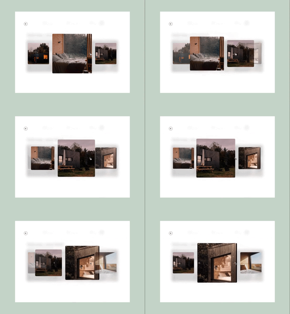
The current product only shown one image of the outside of the cabin when on the booking page. To make the experience more fun and interactive whilst promoting the cabins more I added an additional feature of a slider gallery.
